 Ask Alvin (AI Chat)
Working with Multi-Item Modules
Some CMS Modules support multiple repeated items inside one structured section. Examples include card layouts, timelines, feature lists, steps, and other modules that repeat the same pattern several times.
Use multi-item modules when several pieces of related content should share the same layout and visual treatment.
Insert Multiple
Modules that support repeated content display a Multi-Item label or an Insert Multiple option.
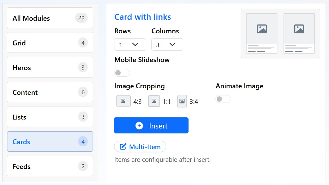
Some modules can generate multiple repeated items from one configuration step.
When Insert Multiple is available, click it to configure the module before insertion.
Common options include:
- Rows: controls how many rows of repeated items are created.
- Columns: controls how many columns appear in each row on desktop.
- Mobile Slideshow: changes how items display on mobile devices.
- Image Cropping: controls the image ratio used for item images.
- Animate Image: enables image animation when available.
Click Insert to generate one structured module containing the configured repeated items.
Editing Items After Insertion
After insertion, each item can be edited inside the visual editor. Replace placeholder headings, text, images, links, and icons with the final content.
Keep each item similar in length and structure when possible. Consistent item length helps repeated layouts look balanced.
Mobile Behavior
When Mobile Slideshow is enabled, repeated items can become swipeable on mobile devices. When it is disabled, items stack normally.
Choose the mobile behavior based on the content. Short, visual cards can work well in a slideshow. Longer text-heavy items are often easier to read when stacked.
Best Practices
Use multi-item modules for content sets that naturally belong together, such as services, benefits, process steps, staff highlights, or feature comparisons.
Avoid forcing unrelated content into one repeated module. If items do not share the same purpose or structure, use separate sections instead.
Learn More
For choosing modules from the library, see Using Modules to Build Pages. For row and column layout controls, see Adding and Configuring Grid Layouts. For icon-based item designs, see Inserting Font Awesome Icons.