 Ask Alvin (AI Chat)
Inserting Font Awesome Icons
Font Awesome icons can be inserted into editor content from Mobi Workspace. Icons can help support short callouts, feature lists, buttons, and visual labels when they are used consistently and sparingly.
Mobi Workspace is the editor workspace used for styles, modules, grids, and icons.
Open the Icons View

Click the Mobi Workspace button in the editor toolbar to open the shared workspace.
Mobi Workspace opens to Styles by default. Click Icons on the left side of the workspace to open the icon picker.
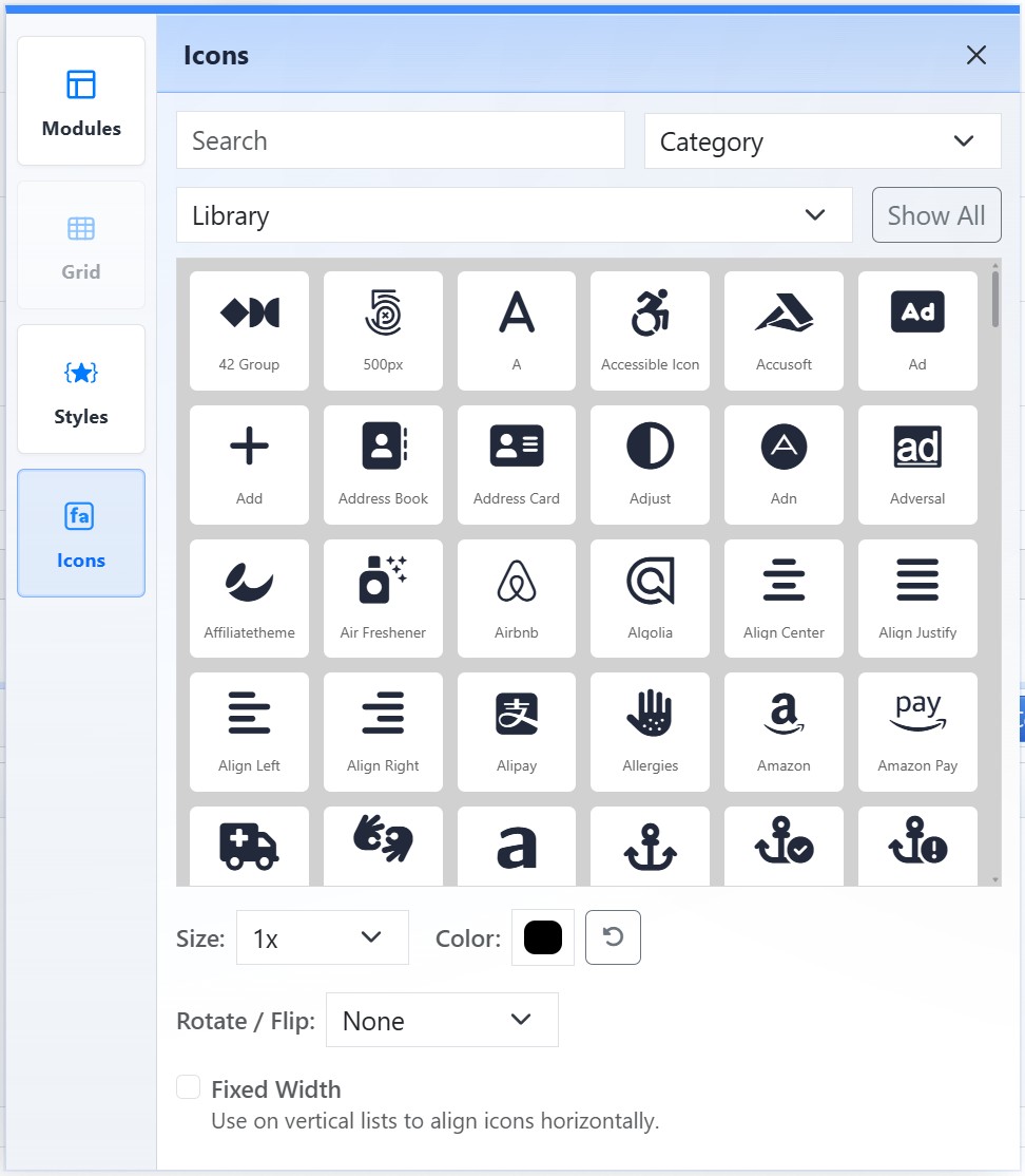
The Icons view lets you search, filter, style, and insert Font Awesome icons.
Find an Icon
Use Search to find an icon by name.
Use Category to filter icons by category.
Use Library to filter by the available Font Awesome library.
The icon grid shows matching icons. To keep the picker fast, it shows the first set of results by default. Click Show All to render every match, or narrow the search for a faster list.
Icon Settings
After selecting an icon, configure its appearance using the settings below the grid.
Use Size to choose the icon size. Leave it at the default size when the icon should inherit the surrounding text size.
Use Color to choose a color. Use the reset control when the icon should return to the default color.
Use Rotate / Flip to rotate or flip the icon when needed.
Use Fixed Width when icons should align evenly in a vertical list.
Insert the Icon
Select the icon and settings, then insert it into the editor content.
Review the inserted icon in context. Icons should reinforce the nearby text rather than replace necessary words.
Learn More
For icon use inside lists and structured sections, see Working with Multi-Item Modules. For applying color and spacing consistently, see Applying CMS Styles. For basic text and list tools, see Basic Editing Tools.