 Ask Alvin (AI Chat)
Applying CMS Styles
CMS Styles applies site-specific design styles to selected content. These styles are predefined for the website and help keep content consistent with the site's design system.
Styles are now managed in Mobi Workspace, the editor workspace used for styles, modules, grids, and icons. Mobi Workspace opens to Styles by default.
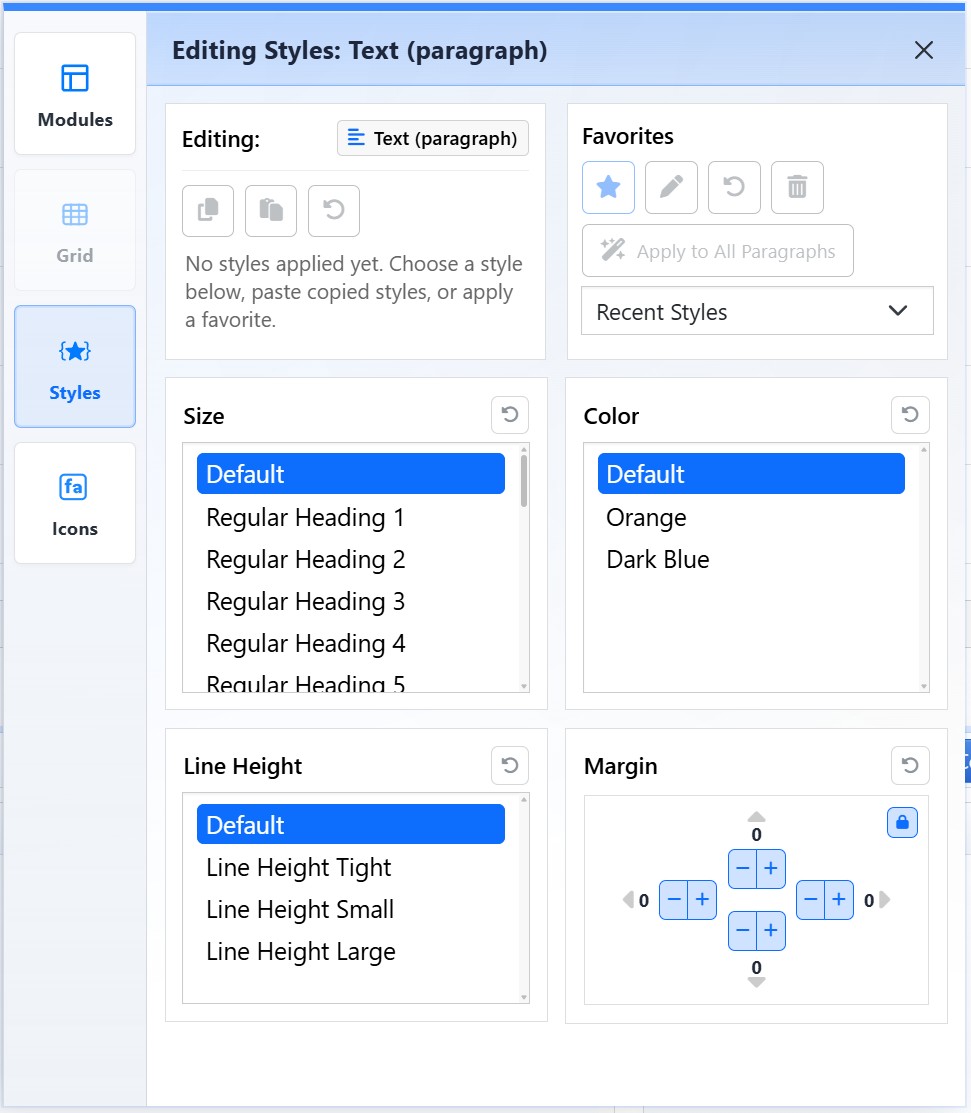
The Styles view changes based on the selected content and applies site-approved design treatments.
Open Mobi Workspace

Click the Mobi Workspace button in the editor toolbar to open Styles, Modules, Grid, and Icons.
After Mobi Workspace opens, use the buttons on the left side to switch between Modules, Grid, Styles, and Icons.
Because Mobi Workspace opens to Styles by default, you can usually begin styling as soon as the workspace appears. If another workspace view is selected, click Styles on the left.
How Styles Work
Styles are context-aware. The available options change based on what is selected in the editor.
Styles can apply to:
- Paragraphs and headings.
- Lists.
- Images.
- Other supported editor elements.
Most styles apply at the block level. If you click inside a paragraph and apply a style, the style applies to the whole paragraph, not only one word.
Available Styles by Content Type
The Styles view changes based on the selected element. Text, buttons, images, and tables each expose style groups that make sense for that content type.
| Text | Buttons |
|---|---|
|
Text styles can control size, line height, spacing, color, shadows, and borders.
|
Button styles can control button treatment, size, spacing, shadows, borders, and radius.
|
| Images | Tables |
|
Image styles can control fit, position, aspect ratio, shape, shadow, spacing, and borders.
|
Table styles can control base table treatment, striping, hover behavior, borders, compact sizing, spacing, and border treatments.
|
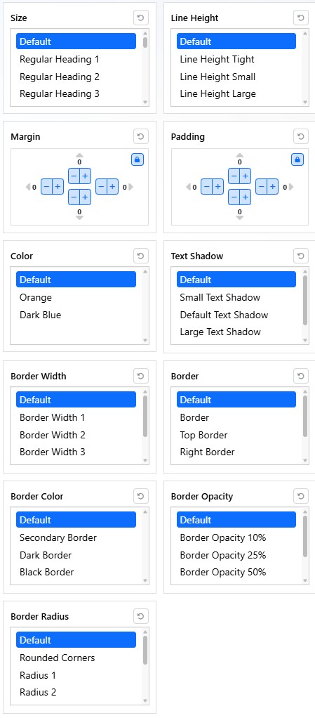
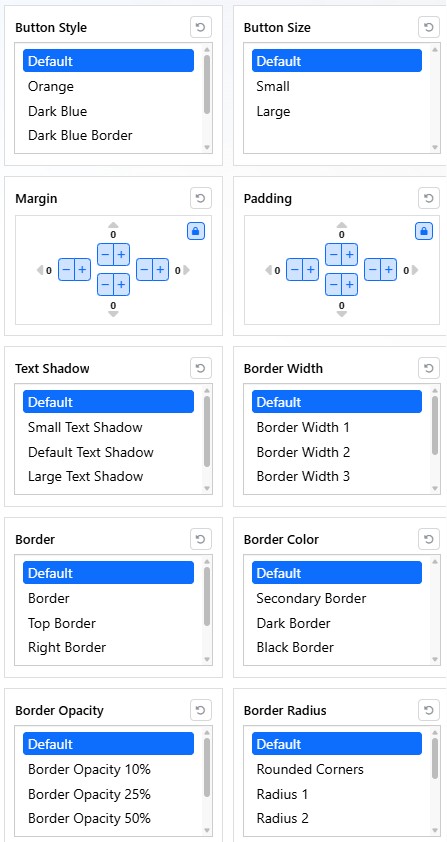
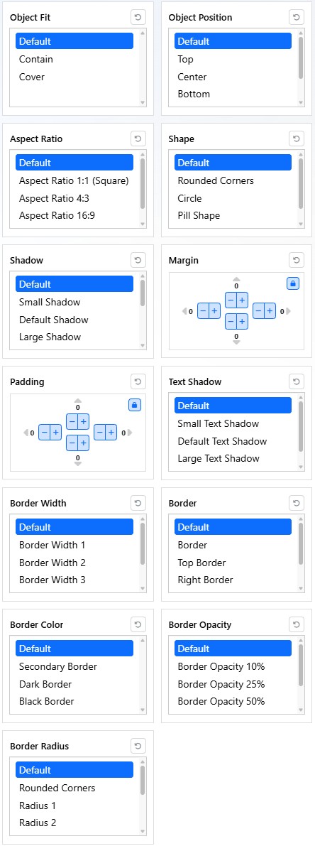
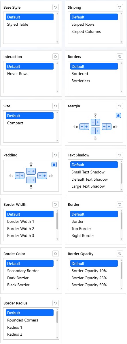
The available options are site-specific. Select Default in a style group to remove that custom style and return the selected content to the default site styling for that group.
Current Styles and Favorites
The Editing area shows the type of content currently being styled, such as text, an image, or another supported element.
Use the copy, paste, and reset controls when you need to reuse or remove styles from the selected content.
Use Favorites to save frequently used style combinations when the site supports them. Favorites can help apply the same approved treatment to similar content more quickly.
Best Practices
Use Styles for consistent visual treatments. Avoid stacking multiple spacing, color, or size styles without a clear reason.
Add links to text before applying button-style treatments so the style is applied to the correct linked element.
If the result does not look right, return the affected style group to Default and apply the desired style again.
Learn More
For image-specific styling, see Adding Images in the Content Editor. For layout controls that affect rows and columns, see Adding and Configuring Grid Layouts. For inserting page sections from Mobi Workspace, see Using Modules to Build Pages.