 Ask Alvin (AI Chat)
Adding and Configuring Grid Layouts
Grid layouts let you arrange content in rows and columns. Some grids are inserted from Modules, and some modules include grid areas that can be customized after insertion.
Grid settings are now managed in Mobi Workspace, the editor workspace used for styles, modules, grids, and icons.
Open the Grid View
Open Mobi Workspace from the editor, then click Grid on the left side of the workspace when you are editing a grid layout.
The Grid view includes three tabs:
| Row | Column | Background |
|---|---|---|
|
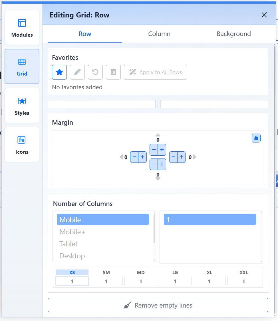
The Row tab controls row-level spacing, responsive column counts, favorites, and empty-line cleanup.
|
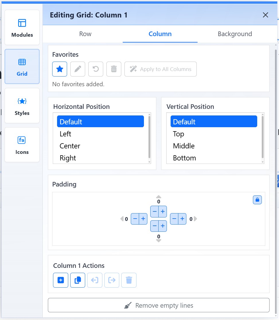
The Column tab controls the selected column's alignment, padding, favorites, and column actions.
|
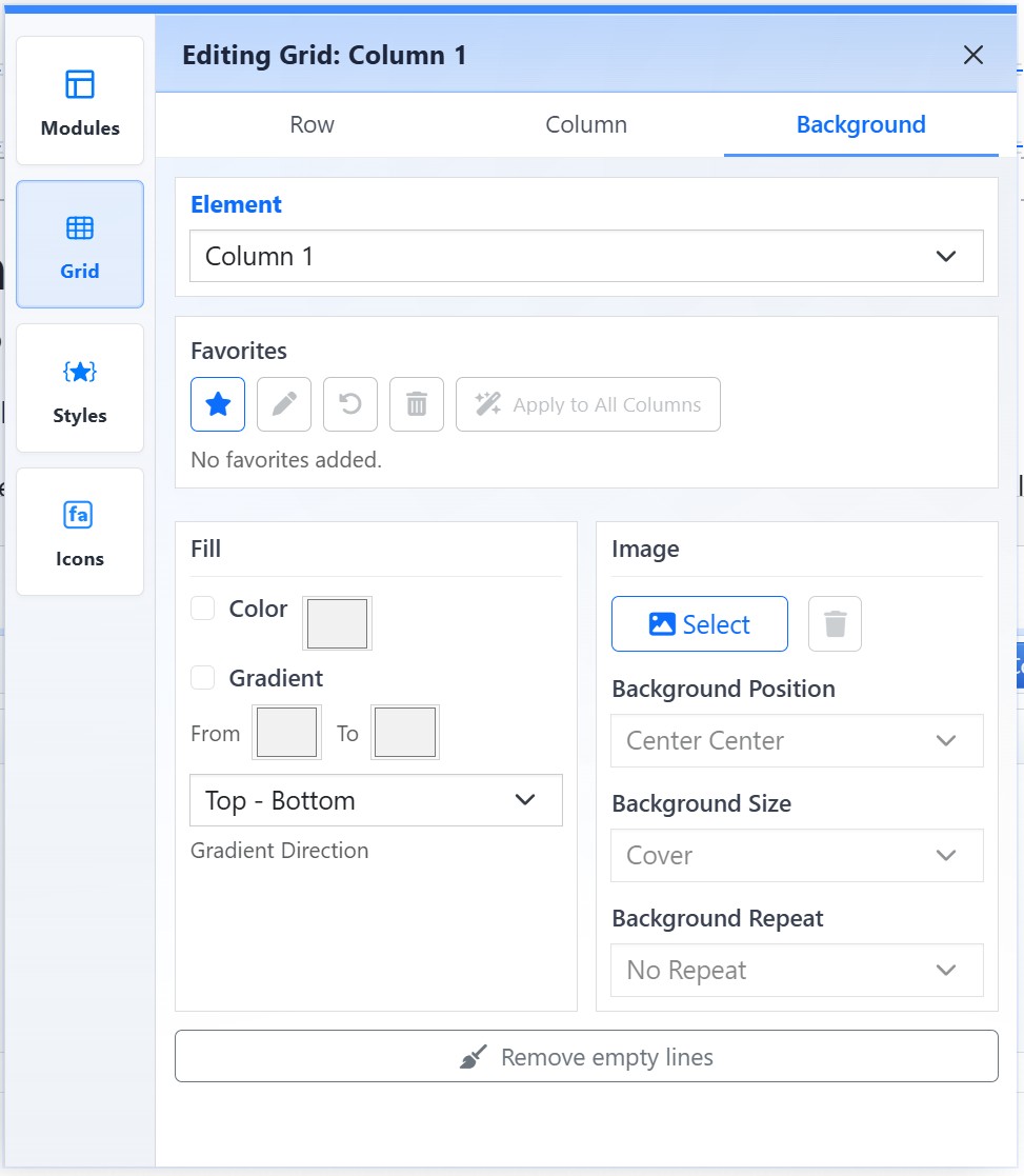
The Background tab controls background color, gradients, images, and background image behavior.
|
Row SettingsUse the Row tab to control the selected row. Margin adjusts spacing around the row. Number of Columns controls how many columns appear at each responsive breakpoint. Breakpoints can include Mobile, Mobile+, Tablet, Desktop, and larger screen sizes. The breakpoint summary shows the selected column count for each screen size so you can review how the layout will adapt. Use Remove empty lines to clean up extra blank paragraph lines within the active row. |
Column SettingsUse the Column tab to control the selected column. Horizontal Position controls left, center, or right alignment. Vertical Position controls top, middle, or bottom alignment. Padding adjusts spacing inside the column. Column Actions can include adding a column, cloning the current column, moving the column left or right, and deleting the column. |
Background SettingsUse the Background tab to style the selected grid element. Choose the target element, then configure background options. Background settings can include solid color, gradient color and direction, background image, image position, image size, and repeat behavior. Use background images and gradients intentionally so text remains readable. |
Favorites and Reset Controls
The Grid view includes favorites and reset controls that help reuse or remove grid styling. Favorites can be useful when the same row or column treatment is used repeatedly on a page.
Use reset controls when a grid setting should return to the default site behavior.
Responsive Editing
Grid settings support responsive behavior. Review the column counts and layout behavior for each breakpoint, especially when changing desktop layouts that also need to work on mobile.
Some layouts can also be adjusted directly in the editor by dragging column dividers or row-height handles.
Learn More
For inserting grids from the module library, see Using Modules to Build Pages. For styling individual text and image elements inside a grid, see Applying CMS Styles. For repeated card-style layouts, see Working with Multi-Item Modules.