 Ask Alvin (AI Chat)
Understanding Form Field Types
Form fields are the building blocks users complete when submitting a form. Field Management organizes fields into three groups:
- Basic Fields
- Pre-Built Fields
- Sections
Basic Fields
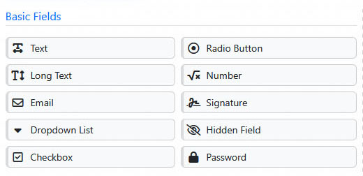
Basic Fields provide common inputs such as text, email, dropdown, checkbox, radio button, number, signature, hidden, and password fields.
Basic Fields are general-purpose inputs. They include:
- Text for short answers.
- Long Text for longer written responses.
- Email, used when the submitted value should be a properly formatted email address.
- Dropdown List, used when the user should choose from a predefined list.
- Checkbox, used when the user can select one or more options.
- Radio Button, used when the user should select exactly one option.
- Number, used when the submitted value must be numeric.
- Signature, used when the user needs to provide a drawn signature.
- Hidden Field, used when a value should be submitted with the form but not shown to public users.
- Password, used when the submitted value should be masked while the user enters it.
Pre-Built Fields
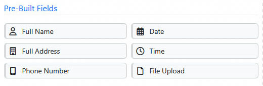
Pre-Built Fields provide structured inputs for common information such as names, addresses, phone numbers, dates, times, and file uploads.
Pre-Built Fields are common field groups or specialized inputs. They include:
- Full Name
- Full Address
- Phone Number
- Date
- Time
- File Upload
Use Pre-Built Fields when you need common information in a structured format.
Sections
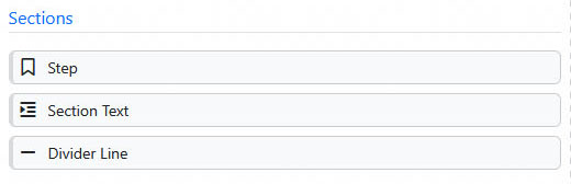
Sections provide layout and organization tools, including steps, section text, and divider lines.
Sections help organize the form. They include:
- Step to divide a form into multiple screens or stages.
- Section Text to add instructions or explanatory copy inside the form.
- Divider Line to create a visual break between parts of the form.
Learn More
For field configuration settings, see Configuring Form Fields and Layout. For multi-step and section elements, see Using Steps, Section Text, and Divider Lines.