 Ask Alvin (AI Chat)
Configuring Form Fields and Layout
When you select a field in the builder workspace, its settings appear in the left configuration panel.
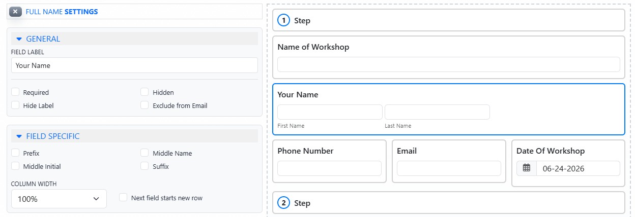
Selecting a field opens its settings panel, where general, field-specific, and layout settings can be adjusted.
General Field Settings
Most fields include General settings. General settings can include:
- Field Label is the name shown above the field on the public form.
- Instructions add helper text for the user.
- Required means the field must be completed before the form can be submitted.
- Hidden keeps the field from appearing to public users while still allowing the form to submit a stored value.
- Hide Label keeps the field visible but suppresses the label.
- Exclude from Email omits the field from notification emails that include form data. This does not remove the field from saved submission data.
Field-Specific Settings
Many fields also include field-specific settings. These settings depend on the selected field type.
Common field-specific settings include:
- Placeholder text
- Minimum or maximum character limits
- Minimum or maximum numeric values
- Accepted file types
- Default values
- Option lists
- Orientation
- Password requirements
- Date or time limits
Layout Settings
Layout settings control how fields line up in the public form.
Width settings can make a field span the full form width or share a row with other fields.
Next field starts new row forces the following field to begin on a new line, even if the width settings would otherwise allow it to appear on the same row.
Learn More
For available field types, see Understanding Form Field Types. For step-based forms and section elements, see Using Steps, Section Text, and Divider Lines. For how field changes affect saved data, see Understanding How Form Submission Data Is Stored.